![]()
CBC.ca has recently redesigned their front page, just about a year after they underwent a major redesign, incorporating a mostly standards-based approach. While there doesn’t seem to be a big change, they’ve made a few small changes to direct their readers’ focus to different areas. For example, three big blocks in a horizontal row (with accompanying images) now direct users to the top stories in news, sports and arts & entertainment. Even more attention is drawn to the big header at the top of the page, that is used to focus users’ attention to the CBC’s traditional media offerings on TV and radio, headlining what major shows will be airing that day. One might wonder why the CBC is attempting to push people back to traditional media when online media is all the rage nowadays.
While I find the new design to be refreshing and more visually attractive, there are some deficits with it.
First, the good

The changes to the front page, as mentioned, haven’t been that big, and while some may think this is lazy, it’s actually a good idea when you have a huge and varied user base. People like familiarity (see the Active User Paradox), and a huge change would likely disrupt them for long enough to see a drop off in readership. By making small incremental changes, you can get a wide and varied user base to accept your new layout slowly over time.
One of the other nice things they added was the weather display at the top of the page, since “weather” was consistently a top search at the CBC.ca site. Rather than force a user to pick their city, the weather panel automatically finds your current city based on a geo-IP address lookup. (This I assume) You can, of course, manually select a city if you want, or if the process can’t find your city. This same process is used to display Local News (if available), but this is at the bottom of the page after most of the stuff on the front page.
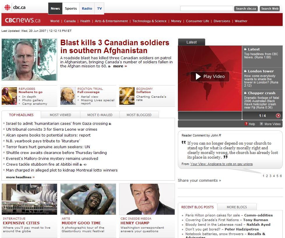
Navigating to the News Page, (one of the four new main links – News, Sports, Radio and TV), you’ll find a page that looks curiously like the old CBC.ca front page. If you miss the old front page, you’ll just want to visit this page instead of the new one. Here, a single headline story is emphasized, followed by “Top Stories”, three more headliners, and then a bunch of sections. New to this page is the addition of a tab for “Most Blogged” stories. This feature uses Technorati to find incoming links to CBC.ca stories to find out how popular a particular story is. There’s also a side panel linking to the blogs of CBC journalists, so you can keep up to date with what they’re doing. Kudos to the CBC for acknowledging the importance that blogs play in online news, however, this can obviously be a double-edged sword, as stories like “Hasselhoff gets sole custody of teen daughters” will get top spot. (Who cares? Just because he was a Wendy’s spokesman?)
Lastly, they moved non-news stuff like the “Diversions” and games section down to the bottom, leaving only news-related items near the top of the page. In my opinion this was a good thing, since if you go to a news site, you should be wanting to find news. However, games-related searches currently occupy three of the top 10 searches on the CBC.ca site, so maybe I’m not in agreement with the masses on this one.
The Bad

Strangely, most of the rest of the site hasn’t been updated to the new layout. Individual stories such as this one remain under the old layout, potentially confusing users who generally don’t having to switch back and forth between layouts, especially on the same site. Perhaps they’ll slowly roll-over the stories to the new layout, but keeping two layouts simultaneously definitely is not a good thing. So far, only the major pages such as News, Sports and Radio/TV have been updated to the new layout, as far as I can tell.
The main navigation bar, containing “News”, “Sports”, “Radio” and “TV” as options is also a bit weird. Firstly, it’s location is a bit out of place – it’s slightly offset into the main header of the page, and while this isn’t bad per se, it just doesn’t fit in with the flow of the rest of the site, which doesn’t use this technique. For that reason, it looks tacked on – like a band-aid on the scrape of a child’s knee. The choice of options is also a bit perplexing. Firstly, including TV and Radio, in addition to the main page header being a conduit for TV/Radio listings, one has to wonder if CBC.ca is really committed to online news, or is merely being a cheerleader for their traditional media offerings. And, while “Sports” was an obvious option for a main header, what happened to Business/Finance? It’s apparently been relegated to a small text link hidden somewhere in the front page.
And, while on the news portal page, news is up-front and center, on the main front page, a good portion is taken up by the header pointing you towards TV/Radio. In fact, if you know about the Golden F in usability, you’ll realize that most people will only really look at this part of the page, and won’t see much of the news.
Perhaps this was intended – CBC.ca has to be more than just news, and has to cover all aspects of the broadcasting corporation, with TV and radio being their staple. Sort of like the difference between ABC.com and ABCNews.com. However, the old site didn’t make this distinction, and seemed to work well for most people. Hopefully people will get used to this separation in the future.
The Ugly
Of course, what I say doesn’t matter too much. (Though I like to think that it does) What really matters is what the overall readership base thinks, and CBC knows this, so that’s why they crafted a letter to their audience requesting feedback. In it, Steve Billinger, Executive Director at CBC, says:
We’re listening to you; we know you’re looking for these technological innovations—and it’s our job at CBC to give them to you. The digital media landscape is constantly evolving, with new innovations being developed every day—and Canadians expect us to be ahead of the curve. This is why millions of you come to CBC.ca every day for the latest in news, arts, entertainment and sports.
We’ve already launched our News and Sports portals, with Entertainment and other sites to follow later this summer. Enjoy, and thanks for visiting.
Okay, so maybe we will get more options other than just News/Sports/TV/Radio in the main navigation. But I still don’t get why they’re trying to divert so many people back to TV when they’re talking about the digital media landscape
at the same time.
But what do the people think? An informal survey of their comments to the CBC regarding the new design shows that maybe 1/3rd to 1/2 of the people posted negative reviews of the new design. Keep in mind, this was an informal poll – the only people that wanted to say something were part of it. Generally speaking, people with negative opinions tend to voice them louder than those with neutral or good ones.
[…] Chng gives a good critique of the […]
Thanks a lot for sharing this with all folks you actually know what you’re speaking about! Bookmarked. Please also talk over with my website =). We could have a link alternate contract between us