On the heels of a controversial update to the iPhone SDK’s license agreement, Apple has unexpectedly approved Opera Mini for iPhone for distribution in its App Store.
Opera had previously announced that it had submitted its browser to the App Store for approval back on March 23rd, in an effort to drum up support for its inclusion in the App Store. Back then, many suspected it would likely be rejected on the basis of it duplicating built-in functionality on the iPhone, namely the included Safari web browser. (Though some questioned this analysis)
Whatever the reason, this comes as a surprise to many, especially given Apple’s most recent behaviour towards potential competitors and development on the iPhone in general. Nonetheless, let’s give Opera Mini for iPhone a quick test drive!
The Opera Mini advantage
To begin, it’s worthwhile to understand that Opera Mini is not a regular web browser, in that it does not make direct connections to websites to retrieve their content, unlike Safari on the iPhone or any other desktop web browser. Instead, all requests are handed through a proxy server that Opera controls. This proxy server retrieves the remote web page, reformats the content for better display on a mobile screen and finally compressed for delivery to the end device. The format used is Opera’s own, called OBML, and furthermore the pages need not be delivered to your device over HTTP. (More information on this Opera Mini infrastructure is available here.)
Ostensibly, all of this work is done to improve the mobile browsing experience in at least two ways. Firstly, the size of each webpage is reduced, thus speeding load times. Secondly, the content is reformatted by Opera’s servers to allow for mobiles to better display content that was only designed with computer monitors in mind.
These features certainly made sense for a phone like the Samsung M510, my first mobile. But what about the iPhone 3GS and its larger, high-quality screen and faster HSDPA access speeds? In this case, are these optimizations even needed or helpful?
The iPhone Experience
The Opera Mini browser has the same general UI layout as Mobile Safari, which is unsurprisingly given the smaller real-estate of mobile screens – there are only so many UI configurations for a web browser on such a space and even fewer potential effective ones. There’s the address bar up top, with a web search field in the upper right corner. The list of search engines is also configurable. Standard browser buttons such as back/forward, reload and tabs are at the bottom of the screen.
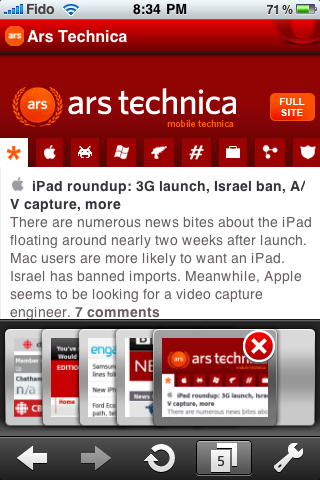
When opening Opera Mini the previous state of the app is restored, so the current page you’re on as well as any open tabs you had when you closed the browser remain. This was pretty much expected – anything less would be a huge mark against the app. Opera Mini has a unique tab switcher, one that’s arguably better than Safari’s. When activated, it allows you see to quite a few more tabs than Safari, which just shows you the previous and next. Switching between them is pretty easy, as is opening a new tab.
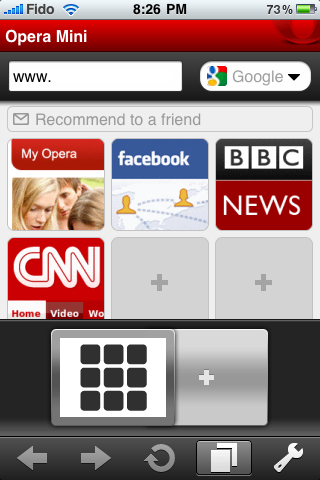
When opening a new tab, the default page is Opera’s “Speed Dial” feature, something a heck of a lot more useful than the blank tab Safari gives you. It’s easy to configure what pages show up here.
Reading webpages with Opera Mini
The standard tasks of scrolling and zooming were okay, though there are some differences from Safari. In particular, it didn’t appear possible to click a link based on “small” text without zooming into the appropriate section; zooming is also accomplished with a single-tap, not a double-tap. I suspect the two changes go hand-in-hand. This is actually a decrease in functionality from Safari – Safari had some pretty good detection for helping you click smaller links with fat fingers without having to resort to zooming in on the area. Opera now forces the issue.
Opera also implements double-tap to zoom out. But it’s a bit more sensitive as to exactly what constitutes a “double-tap”. In Safari, you don’t have to double-tap exactly in the same spot in order to trigger the zoom out action. Opera Mini seems to be a bit more sensitive to exactly where you double-tap before it zooms out. This impairs usability somewhat.
Selecting text was straightforward; simply tap and hold a section and you can select text using a resizable box. The text can then be copied or used to search.

Other features
Because Opera Mini was going through a proxy server and dynamically reformatting the content before passing it to your device, I had some worries that websites would not properly detect the user-agent of the iPhone and thus would not redirect to iPhone-specific sites. But during my testing, thankfully this was not the case. Most redirected properly to their mobile versions, if available.

Opera Mini also two other features of note: Full screen and Mobile view. Full screen (see below for The Globe and Mail’s website) simply removes the bottom bar and gives you only the minimum amount of browser UI you’d need, saving you a little more space for the actual website.
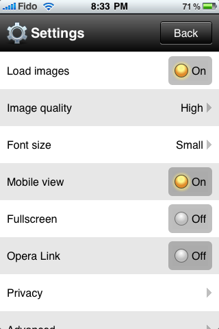

Mobile view, which is far less useful, causes Opera Mini to reformat the entire website to “fit” the layout of the screen, rather than just text. I use quotes with the term “fit”, because the reformatting of Mobile view is in general, quite awful and results in a mangled look. Perhaps it made sense to do this kind of reformatting on the extremely small screens of older mobiles, but it simply makes no sense on the iPhone. You can see the results of this by comparing the CBC News website in normal versus mobile rending mode below.


Comparison with Safari
The real question, however, is how does Opera Mini compare with Mobile Safari? After all, this is its main and perhaps only competition it faces on the iPhone, and furthermore Safari is entrenched with most users simply because of its strong tie-in with the iPhone platform. If Opera Mini hopes to win any market share, it can’t just be as good as Safari – it has to be a lot better so people will switch.
Unfortunately, this isn’t the case. In my opinion, Opera Mini is actually behind Mobile Safari in many areas. Furthermore, the main benefits of Opera Mini actually don’t matter that much on the iPhone.
Opera Mini uses its proxy server setup in order to speed access by compressing pages before they’re sent to your device. During testing, this benefit was minimal over 3G or Wi-Fi networks and in fact Opera Mini may have been slower in some cases due to the delay induced by having to wait for page compression on Opera’s servers. To be fair, Opera focuses on the comparative speed advantage on 2G/EDGE data networks, so if you’re in that situation it may have some real benefit.
But even considering this, the entire model that Opera Mini uses completely breaks end-to-end security, so accessing HTTPS sites no longer guarantees confidentiality unless you completely trust Opera and trust that Opera’s servers won’t be compromised.
But these might be implementation details – what do they matter? Unfortunately, the end user experience also suffers in the way text is rendered and formatted by Opera Mini. See the comparison of Engadget’s site below in Opera Mini and Mobile Safari:

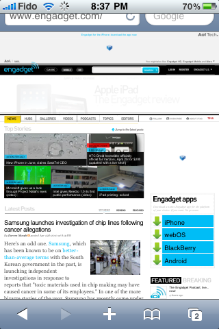
At the fully-zoomed out level, all text is basically unreadable in Opera Mini, while in Safari this is not the case. Some images also looked aliased, owing to Opera’s compression of the page.


Even zooming in, we can see some differences. Firstly, Opera Mini seemingly switches the rendering of the website-specified font to a sans-serif one, while Safari maintains the actual font for the text. Safari also keep the original layout, allowing the text to flow around the image and still be readable. Opera Mini seems to just reformat the text to fit the width of the screen without regard for maintaining the overall layout of the site. In this respect, Safari better preserves the original look and feel.
But perhaps the biggest hit against Opera Mini is its lack of fully supporting JavaScript. This is again due to the proxy model it is using. Because of this, the functionality of web applications is severely impaired or even blocked. Meanwhile, Safari is a fully-featured browser supporting Ajax techniques and even subsets of HTML5. These differences are most apparent when looking at how Gmail renders in each browser:


Opera Mini cause Gmail to step down to a primitive version, something you’d expect to see on older mobiles. Safari, however, has access to an iPhone-optimized version of the web application, which Google has been available for some time, is being constantly improved and arguably better than the built-in Mail app.
The fact that Safari works so well for the web should be no surprise, since Apple’s original plan was for their WebKit browser to be the only “SDK” for the iPhone. That is, web applications would be the way developers would make apps for the iPhone – no App Store involved. With this in mind, Apple engineers put a lot of work in to Safari to make sure it would not only be a good web browser, but one that would be able to run the future of web applications, and look good doing so.
Because of this, Opera Mini had a formidable opponent to go up against. The fact that it couldn’t beat it is not a reflection of Opera’s ability, but more a reflection of the time Apple spent on Mobile Safari.
Conclusion
I may have seemed a bit harsh and some of the criticism of Opera Mini may have been unwarranted. After all, it’s a free download, so can you really complain? I just don’t think I’ll be using it to replace Safari any time soon and that its current popularity is simply a result of the drama played out in the App Store and exaggerated by blogs.
Looks like the comparison for CBC News with Safari and Opera is wrong. If you look at the address bar, the Opera Mini says “iphone.cbc.ca” which is obviously an optimized version for iPhone, and the one on Safari is just a normal desktop one.
@tablo
I didn’t do a comparison of CBC News on Opera and Safari. The only screenshots I have of CBC News are using Opera.
The first one *is* at iphone.cbc.ca, but I was using that to point out that the user-agent is properly detected, allowing you to be directed to the proper version of the site, as the developer intended.
The second and third screenshots of Opera on CBC demonstrate Opera Mini’s reformatting capabilities.
The only comparison of Opera with Safari here is with Engadget and Gmail.